Saturday, 22 February 2014

Paper Cutting Presentation

Now it's time for Ms Lisa to finalize our drawings...After she choosing my symmetrical sketches, Ms Lisa keen on 2 of my asymmetrical drawings, it's hard to choose it because Ms Lisa said 2 of them looked quite nice. But yet, she chose it. Below is my final sketches.

Symmetrical drawing:


Asymmetrical drawing:


After that, it's time to start my cut out session! I started to cut the symmetrical first, because the drawing that I need to cut out is difficult and complicated. As the presentation was around the corner, so I would need to work faster. 


Seriously, during the symmetrical cut out, I went crazy because it was really hard and complicated. I would need to cut a small piece of paper and paste it back one by one. Besides, presentation was coming soon and I had to burn my midnight oil to finish it. But, as I promised myself and Ms Lisa that I will work harder and harder in this semester, so no matter how hard is it, I will still go through it, I will prove everyone that I can do it! 
Yeah~I did it! Here's my final outcome...


Here, I have to say 'Thank you' to Ms Lisa. I've learnt a lot from this assignment, not just the cutting skill but it also taught me not to give up whenever I have troubles. Finally, I succeed. And fortunately, the final outcome didn't disappoint Ms Lisa. I felt really proud of myself because I did it. Thank you, Ms Lisa! 


Friday, 21 February 2014

Paper Cutting Assignment

"What's in your square?" Today's lesson was about our very first individual assignment. Basically, "what's in your square" is about expanding the squares. We will have a square paper and what we need to do is design anything within the square. After that, we need to cut out our drawings and expand it by pasting it out of the square. There's two things we have to do, one is a symmetrical paper cutting, another is asymmetrical paper cutting. Actually this assignment is a bit similar with one of our assignment in semester 1 which was also a paper cutting assignment. I felt quite excited because I love paper cutting so much. Let's have a look of my rough sketches of this assignment.

Asymmetrical drawing:


Symmetrical Drawing:


Next, we will need to finalize our sketches by Ms Lisa. She will be choosing one of the best sketches from our symmetrical and asymmetrical drawing.
Thank you! :D


Friday, 4 October 2013

2 Dimensional Design First class,First assignment

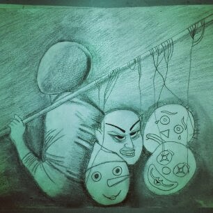
I was so excited that I finally got into semester 2...So,this was the first day of 2D design with Miss.Lisa.As we were told to bring our basic tools to class and after that we were asked to make anything about how we feel right now or our self portrait as similar as what we did in semester 1.We can even use materials that we can get around in the campus.

Then,I decided not to find anythings in campus as I did it in semester 1,I tried to do something differently.Eventually,I did a drawing which describe myself and what I was thinking in that moment.


A man with four masks...Basically,the man who is holding the faces doesn't have any expression as I imagined it as myself.The original 'me' don't have any expressions,don't know about myself and as time goes on,I see things! I finally find myself,I'm getting more confident,I know what should I do right now,I have to work harder and harder in order to success.One of my classmate saw this drawing and she just asked me 'do you wear any mask before you going out?' The answer is yes,I do! But I would just wear the happy mask when I'm going out,that's why I drew 2 happy faces out of 4 in the drawing,because I think that's me.People know that I always keep smiling whenever I get something troubles,happy face covers me,it covers my heart,that's why people don't really see my evil face or sad face,because I normally won't show that kind of expressions especially in front of people.I want to make people around me be happy,I want to be stronger.This is me!


Friday, 23 August 2013

Final Assignment- A set of 3 greetings cards


Yeah...it's time to say goodbye to this subject Principle Of Design....
So, before it ends,there's still a FINAL assignment to do...
Which is a set of 3 greetings cards...
This sounds great and interested to me to do the greetings cards... :)
Firstly, we have to research and pick a theme,we can choose any occasion on making the greetings cards...
The most important thing that we have to do is that, we have to apply principle of design that Ms.Lisa 
have been drumming into us throughout the entire semester...
And we could use any materials to make it,the 
manageable size will be A5 size...

So,I did research and finally,I decided to use 'flowers and love' as my theme...
After that,I went to few art shops to buy some attractive materials for this assignment...
While making these greetings cards,I really really enjoyed the process...


This is my first card, Valentine day :)


 Second card,Wedding day

 Third card, Anniversary Day 


I actually felt satisfy about the outcome of my cards...
But Ms.Lisa is right, she said that inside of the cards is disappointed :(
Ya,compared to others's cards, my cards are too simple...
Here I apologize to Ms.Lisa about the mistakes that I have made...
I promise that I will put more effort on semester 2...
Thank you Ms.Lisa for lecturing us for the whole semester :)

Thursday, 22 August 2013

Colour Wheel Assignment-Floating Project

Hi...feeling curious about this assignment?
I swear,this is considered as an enormous assignment for our subject Principle of Design throughout this semester 1....
Guess what? Yes, this time we are going to create a huge object to float on our Taylor's lake by using the concept of colour wheel...
And we will be working in groups of 5 or 6 members,so here are my group members: Aderline(leader),Suk Sian,Nicoule,Annie and Lok Yen...
We felt so surprised and excited about this project...
Before we start to do such a huge project,we had to sketch it out first and let Ms.Lisa to approve our work...
Finally,we decided to make a pavilion house which the lanterns will be surrounded the house...


So,this is our modelling house before we doing the real pavilion


 This is the sample of lanterns


The pavilion in the progress...

This is our lanterns by using different colours,it looks really nice


The pavilion and lanterns were floating on the lake :)


Our successful outcome,felt so satisfied about it


During the progress of doing this assignment, we had so many troubles and maybe each of my group members have their own comments and so on, but in fact, we could still overcome it...
I really felt proud of myself and my group members,and also,we had so much unforgettable memories during this project...
It's really precious for me :D


Sunday, 14 July 2013

The concept of colours

Definitions :

Hue #
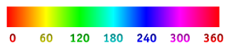
Hue is one of the main properties of a color, defined technically, as "the degree to which a stimulus can be described as similar to or different from stimuli that are described as red, green, blue, and yellow (the unique hues). The other main correlatives of color appearance are colorfulness, chroma, saturation, lightness, and brightness.
Usually, colors with the same hue are distinguished with adjectives referring to their lightness and/or chroma, such as with "light blue", "pastel blue", "vivid blue". Exceptions include brown, which is a dark, orange, and pink, a light red with reduced chroma.In painting color teory, a hue refers to a pure color—one without tint or shade (added white or black pigment, respectively). A hue is an element of the color wheel. Hues are first processed in the brain in areas in the extended V4 called glob.

Value #
A very important element in, especially drawings and paintings, is value (or tone). In this context, value means light and dark. Sometimes referred to by the Italian word “chiaroscuro” (literally “light/dark”), value is often described visually by a scale with varying shades of gray arranged between black and white. But remember that colors have values also—what would you call a light value of red? Similar values distributed in patterns throughout a work of art can lead the viewer’s eyes around the piece to receive the message the artist intended to send. Thus value is an important compositional device, but values can be used to create the illusion of space as well. 

Saturation #
Color saturation is a measurement of how pure a color is. The higher the saturation level a particular color is, the more pure the color. Another way of stating the definition of saturation is: the more gray that is in the image, the lower the saturation level. Digital saturation involves increasing or decreasing the numbers of pixels of pure color in a photograph. Manual saturation, however, is affected by adding the complement to lower the saturation, or decreasing the complement which increases the saturation.


Secondary colors #
Secondary colors are three colors that are created by mixing two primary colors together. The three secondary colors are violet, green and orange. Red and blue mixed together create violet, yellow and blue make green and yellow and red mixed together create orange. Violet is placed directly opposite to yellow, between red and blue. Green is placed directly opposite to red and orange is placed directly opposite to blue.

Tertiary colors #
Tertiary colors are created when a primary color is mixed with a secondary color. Examples of this occur when orange is mixed with red, it becomes red-orange, when blue is mixed with green it becomes blue-green and when yellow is mixed with orange it becomes yellow-orange. Tertiary colors are always written with a hyphen in between the primary and secondary color, the primary always written first. Tertiary colors separate the primary and secondary colors of their namesake.

Analogous colors #
Analogous colors are colors that are adjacent or next to one another on a color wheel.An analogous color scheme is one in which only three adjacent colors are used. The theory is that colors work well or harmonize together. Usually one of these colors is dominant, or used more than the other two, in the painting.

Tint #
A tint is a color to which white has been added to make it lighter. Take pink, for instance. Pink is a color, but it's also a tint of red.Sometimes tints are referred to as "pastels." While this is technically inaccurate (pastels are a type of crayon), it's such a common phrase that it's worth noting here.


Shade #
A Shade is simply any color with black added.Just as with making tints, you can mix any of the twelve pure colors together.Then simply add any amount of black and you have created a shade of the mixture.That means you can go from an extremely dark, nearly black to a barely shaded pure hue.Most artists use black sparingly because it can quickly destroy your main color. Some artists prefer not to use it at all. Instead they understand the rules of color well enough to make their ownblack mixtures.Shades are deep, powerful and mysterious. Be careful not to use too much black as it can get a little overpowering. These darks work well in a masculine environment. They are best used as dark accents in art and marketing graphics.

Monochromatic colors #
Monochromatic colors are all the colors (tints, tones, and shades) of a single hue.Monochromatic color schemes are derived from a single base hue, and extended using its shades, tones and tints (that is, a hue modified by the addition of black, gray (black + white) and white. As a result, the energy is more subtle and peaceful due to a lack of contrast of hue.

Warm colors #
Reds, oranges, and yellows are considered warm colors. But if you compare different reds, oranges, or yellows (or even the colors considered cool, such as blues), you'll see that there are also warm and cool versions of each of these colors (relative to each other only).

Cool colors #
Blues, greens, and purples are considered cool colors.

Regal #
Freshness #
Joy #
Passion #