
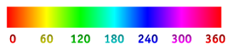
Hue #
Hue is one of the main properties of a color, defined technically, as "the degree to which a stimulus can be described as similar to or different from stimuli that are described as red, green, blue, and yellow (the unique hues). The other main correlatives of color appearance are colorfulness, chroma, saturation, lightness, and brightness.Usually, colors with the same hue are distinguished with adjectives referring to their lightness and/or chroma, such as with "light blue", "pastel blue", "vivid blue". Exceptions include brown, which is a dark, orange, and pink, a light red with reduced chroma.In painting color teory, a hue refers to a pure color—one without tint or shade (added white or black pigment, respectively). A hue is an element of the color wheel. Hues are first processed in the brain in areas in the extended V4 called glob.

Saturation #
Color saturation is a measurement of how pure a color is. The higher the saturation level a particular color is, the more pure the color. Another way of stating the definition of saturation is: the more gray that is in the image, the lower the saturation level. Digital saturation involves increasing or decreasing the numbers of pixels of pure color in a photograph. Manual saturation, however, is affected by adding the complement to lower the saturation, or decreasing the complement which increases the saturation.

Secondary colors #
Secondary colors are three colors that are created by mixing two primary colors together. The three secondary colors are violet, green and orange. Red and blue mixed together create violet, yellow and blue make green and yellow and red mixed together create orange. Violet is placed directly opposite to yellow, between red and blue. Green is placed directly opposite to red and orange is placed directly opposite to blue.
 Tertiary colors #
Tertiary colors are created when a primary color is mixed with a secondary color. Examples of this occur when orange is mixed with red, it becomes red-orange, when blue is mixed with green it becomes blue-green and when yellow is mixed with orange it becomes yellow-orange. Tertiary colors are always written with a hyphen in between the primary and secondary color, the primary always written first. Tertiary colors separate the primary and secondary colors of their namesake.
 Analogous colors #
Analogous colors are colors that are adjacent or next to one another on a color wheel.An analogous color scheme is one in which only three adjacent colors are used. The theory is that colors work well or harmonize together. Usually one of these colors is dominant, or used more than the other two, in the painting.
 Tint #
A tint is a color to which white has been added to make it lighter. Take pink, for instance. Pink is a color, but it's also a tint of red.Sometimes tints are referred to as "pastels." While this is technically inaccurate (pastels are a type of crayon), it's such a common phrase that it's worth noting here.

Shade #
A Shade is simply any color with black added.Just as with making tints, you can mix any of the twelve pure colors together.Then simply add any amount of black and you have created a shade of the mixture.That means you can go from an extremely dark, nearly black to a barely shaded pure hue.Most artists use black sparingly because it can quickly destroy your main color. Some artists prefer not to use it at all. Instead they understand the rules of color well enough to make their ownblack mixtures.Shades are deep, powerful and mysterious. Be careful not to use too much black as it can get a little overpowering. These darks work well in a masculine environment. They are best used as dark accents in art and marketing graphics.
 Monochromatic colors #
Monochromatic colors are all the colors (tints, tones, and shades) of a single hue.Monochromatic color schemes are derived from a single base hue, and extended using its shades, tones and tints (that is, a hue modified by the addition of black, gray (black + white) and white. As a result, the energy is more subtle and peaceful due to a lack of contrast of hue.
 Warm colors #
Reds, oranges, and yellows are considered warm colors. But if you compare different reds, oranges, or yellows (or even the colors considered cool, such as blues), you'll see that there are also warm and cool versions of each of these colors (relative to each other only).
 Cool colors #
Blues, greens, and purples are considered cool colors.
 Regal #
 Freshness #
 Joy #
Joy #
 Passion #

Hue is one of the main properties of a color, defined technically, as "the degree to which a stimulus can be described as similar to or different from stimuli that are described as red, green, blue, and yellow (the unique hues). The other main correlatives of color appearance are colorfulness, chroma, saturation, lightness, and brightness.Usually, colors with the same hue are distinguished with adjectives referring to their lightness and/or chroma, such as with "light blue", "pastel blue", "vivid blue". Exceptions include brown, which is a dark, orange, and pink, a light red with reduced chroma.In painting color teory, a hue refers to a pure color—one without tint or shade (added white or black pigment, respectively). A hue is an element of the color wheel. Hues are first processed in the brain in areas in the extended V4 called glob.
Value #
A very important element in, especially drawings and paintings, is value (or tone). In this context, value means light and dark. Sometimes referred to by the Italian word “chiaroscuro” (literally “light/dark”), value is often described visually by a scale with varying shades of gray arranged between black and white. But remember that colors have values also—what would you call a light value of red? Similar values distributed in patterns throughout a work of art can lead the viewer’s eyes around the piece to receive the message the artist intended to send. Thus value is an important compositional device, but values can be used to create the illusion of space as well.
A very important element in, especially drawings and paintings, is value (or tone). In this context, value means light and dark. Sometimes referred to by the Italian word “chiaroscuro” (literally “light/dark”), value is often described visually by a scale with varying shades of gray arranged between black and white. But remember that colors have values also—what would you call a light value of red? Similar values distributed in patterns throughout a work of art can lead the viewer’s eyes around the piece to receive the message the artist intended to send. Thus value is an important compositional device, but values can be used to create the illusion of space as well.
Saturation #
Color saturation is a measurement of how pure a color is. The higher the saturation level a particular color is, the more pure the color. Another way of stating the definition of saturation is: the more gray that is in the image, the lower the saturation level. Digital saturation involves increasing or decreasing the numbers of pixels of pure color in a photograph. Manual saturation, however, is affected by adding the complement to lower the saturation, or decreasing the complement which increases the saturation.
Secondary colors #
Secondary colors are three colors that are created by mixing two primary colors together. The three secondary colors are violet, green and orange. Red and blue mixed together create violet, yellow and blue make green and yellow and red mixed together create orange. Violet is placed directly opposite to yellow, between red and blue. Green is placed directly opposite to red and orange is placed directly opposite to blue.
Tertiary colors are created when a primary color is mixed with a secondary color. Examples of this occur when orange is mixed with red, it becomes red-orange, when blue is mixed with green it becomes blue-green and when yellow is mixed with orange it becomes yellow-orange. Tertiary colors are always written with a hyphen in between the primary and secondary color, the primary always written first. Tertiary colors separate the primary and secondary colors of their namesake.
Analogous colors are colors that are adjacent or next to one another on a color wheel.An analogous color scheme is one in which only three adjacent colors are used. The theory is that colors work well or harmonize together. Usually one of these colors is dominant, or used more than the other two, in the painting.
A tint is a color to which white has been added to make it lighter. Take pink, for instance. Pink is a color, but it's also a tint of red.Sometimes tints are referred to as "pastels." While this is technically inaccurate (pastels are a type of crayon), it's such a common phrase that it's worth noting here.
Shade #
A Shade is simply any color with black added.Just as with making tints, you can mix any of the twelve pure colors together.Then simply add any amount of black and you have created a shade of the mixture.That means you can go from an extremely dark, nearly black to a barely shaded pure hue.Most artists use black sparingly because it can quickly destroy your main color. Some artists prefer not to use it at all. Instead they understand the rules of color well enough to make their ownblack mixtures.Shades are deep, powerful and mysterious. Be careful not to use too much black as it can get a little overpowering. These darks work well in a masculine environment. They are best used as dark accents in art and marketing graphics.
Monochromatic colors are all the colors (tints, tones, and shades) of a single hue.Monochromatic color schemes are derived from a single base hue, and extended using its shades, tones and tints (that is, a hue modified by the addition of black, gray (black + white) and white. As a result, the energy is more subtle and peaceful due to a lack of contrast of hue.
Reds, oranges, and yellows are considered warm colors. But if you compare different reds, oranges, or yellows (or even the colors considered cool, such as blues), you'll see that there are also warm and cool versions of each of these colors (relative to each other only).
Blues, greens, and purples are considered cool colors.